Cohort analysis is a great way to increase user engagement for your business and generate more revenue. Earlier, paid tools like KISSmetrics gave us the facility to use Cohort Analysis as a way to measure data but now, Google Analytics has launched a beta version of Cohort Analysis, where the webmasters can easily make out the things that are working for them.
What is Cohort Analysis?
You can think of Cohort Analysis as a study of the activities of a particular cohort over a period of time. A cohort is a group of people who are segmented based on a defined time period and share a common set of characteristics. This study takes into account actionable metrics, rather than vanity metrics. Actionable metrics are those that help to improve a product or sales,such as the rate of conversion of a particular product during a period of time, or the rate of retention of customers who signed up when the sale was going on. On the contrary, vanity metrics only provide data about what is going on in the site,such as the number of visits or number of downloads, which offers no insights regarding the improvement of sales.
Why Do I Need Cohort Analysis?
- Customizing products or services based on specific cohorts that behave differently.
- Determining the time taken by a customer in order to make the first purchase.
- Determining the time taken by a customer in order to make the next purchase.
- The retention rate of customers who signed up when a sale was going on.
- The conversion rate of customers who signed up during festive season like Christmas.
- The repeat rate of new orders over a specific period of time like in the first two weeks of each month compared to the last two weeks.
- The average retention rate of customers who signed up through a particular digital marketing channel during a defined period of time.
- Average spends of customers who are acquired at the starting of the year, as compared to those acquired at the end of the year.
The AARRR Metrics for Businesses
Every business wants to know who their customers are, what do they do when they visit their site, what they expect when they visit the site, and what causes them to visit the site repeatedly. As per Abdul Sattar, CEO of Couponmachine.in, “Cohort Analysis gives us a clear and accurate idea of the activity of the customers in order to improve the flow of orders. We have analyzed this report in order to understand the specific deals in which the customers are more interested in. We update such popular deals on our home page, and this helps to increase the flow of orders.”In total, CA helps us to answers the 5 main metrics that are useful for every business as defined below:
- Acquisition: the cost of acquiring first-time users
- Activation: what causes the audience to remain active on the site
- Retention: the retention rate of the customers and identification of the factors that causes the customers to repeat their orders.
- Referral: rate at which people are inviting others to the site.
- Revenue: determining the first point of purchase.
Deciding Your Cohorts Based On Your Business Objectives
First of all, you should be extremely clear regarding your business objectives and exactly what you want to achieve for your business, with the help of the website. Now, decide Cohorts, after segmenting your users based at a specific time period and examine their characteristics. Here is a sample objective and creation of a cohort based on the objective:
Objective:
To increase revenue from PPC campaigns
Example Cohort:
Create several different cohorts,based on the past 12 months, past six months and past three months’ data and analyze when did you generated the maximum average revenue per order,as well as the highest retention rate. If the last six months, cohortsgenerated the maximum average revenue per order along with the retention rate, then examine what did you offered to the users at that point of time which helped the users to order more products and also generated repeated visits. You might have offered some discounts; you might have some product in your stock at that point of time that were liked by the users, but you have currently stopped maintaining that stock; or you may have targeted local cities in the past six months,as compared to international market in the past 12 month campaigns etc. These are some of the data that Cohort analysis can easily tell you. Applying the results obtained from Cohort Analysis can improve your existing campaigns and help you generate more revenue.
How to Do Cohort Analysis Using Google Analytics- Some More Examples to Consider
There is nothing better than taking real life examples to understand the value of Cohort Analysis, so let’s take a look at some more examples.
Example 1- I run an email campaign for 14 days, offering 30% discount on my products. I want to track the behavior of users who signed up during this period.
Simply run a Cohort report after selecting “Acquisition date” under Cohort type, “by day” under cohort size, “user retention” under metric and “last 14 days” under date range.
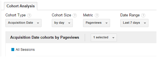
Also, create a new segment named “email” and choose “email” from the “medium” menu under the “traffic sources” as shown in the screenshot below:
Example 2 – I am selling online clothes and I want to see how long the users remain interested in my offers and deals.
Run a cohort report for the past six weeks. Choose “Acquisition date” under Cohort type, “by week” under cohort size, “user retention” under metric and “last six weeks” under date range.
You can easily track the time when the engagement starts to decline.If it happens, say, after four weeks, then you can easily opt for a remarketing or email marketing campaign with some discounted offers in order to reengage users.
Bonus tip: If you have an email database of users you wish to targe,t then you can use FB remarketing to target only those users who are already your customers. This way you can make more money by investing less.
Example 3 – Compare behavior of users who are acquired by organic channels vs PPC ones
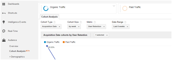
Run a cohort report for the past six weeks. Choose “Acquisition date” under Cohort type, “by week” under cohort size, “user retention” under metric and “last 6 weeks” under date range.
Also, segment the users based on “organic” and “paid” traffic as shown in the screenshot below:
Now, you will get the data of the past six weeks for both organic and paid traffic, and you can easily identify the retention rate of users obtained via organic or paid traffic. You can adjust your spend on these channels accordingly. (For more examples, please refer to this document).
Understand the Choices Available – What is displayed in the Cohort Chart?
The horizontal column displays the time and the vertical column displays the number of sessions. The vertical columns displaying the sessions are the cohorts. Have a look at the technical terms of the elements included in the chart:
The menus that are used to configure the Cohort Analysis report:
- Dimension characterizes the Cohort Type. By default, only one value is available as of now, i.e., the Acquisition date. In future, Google will expand it with other options. The Acquisition date is the date of the first session when the user first arrives on your site.
- Next, you choose the Cohort size. Three options are available: “by day,” “by week,” and “by month.”Selecting “by day” will help you to see the data of customers who were acquired the same day. Similarly, selecting “by week” or “by month” will help you to see the data of customers who were acquired in the same week of the same month respectively.
- Next, you choose the metric that you want to evaluate. The following options are available:
Per User
A- Goal Completions per user
B- Page Views per user
C- Revenue per user
D- Session Duration per user
E- Transactions per user
Retention
A- User Retention
Total
A- Goal Completions
B- Page Views
C- Revenue
D- Session Duration
E- Sessions
F- Transations
G- Users
- Next, you choose the relative date range of the data. The “date range ”and “cohort size” columns are interrelated. This means that the options displayed under the “date range” change, as per the value selected under the “cohort size” column.
Understand the data
Report configured to show Acquisition Date cohorts by the User Retention metric
Chart
The chart displays the cumulative metric values for all cohorts.
Columns
The column identifies the Cohorts based on the menu values that are selected. By default it shows 13 columns. For example, if you chose to display Cohorts by Acquisition Date then the column lists the acquisition date for each cohort.
Rows
The first row displays the total metric value for all cohorts for each column. For example, if the metric is unique pageviews and the columns are daily data, then the first row shows the unique pageviews for the day.
Cells
The cells are used for holding the relevant metric values. For example, if you are using the unique pageviews metric, then each cell contains the number of pageviews per cohort per time increment.
Hence, Cohort Analysis is a great way to measure the user engagement and user retention on your site. It helps you to analyze the metrics that matter the most for your business. Have you benefitted by the Cohort Analysis report? Please share with us in the report below.
Closing thoughts
Though cohort analyses have mostly been relied on for user retention and user behaviour studies, the Google Analytics avatar can be leveraged by web analytics experts to study metrics like page views, session durations, goal completions. Plus, metrics in terms of user selections, such as search queries per user, session duration per group, and page views for a particular user, can also be studied. There’s enough in there to help you make more sense of your users’ behavior, the effectiveness of your marketing tactics, and the success of your promotions mix. Trust this guide and begin your advanced cohort analyses with Google Analytics.
Image credit: CC by Terry Donaghe


