Mobile shopping has exploded in recent years, and online retailers have responded by designing mobile friendly sites and apps. But, rather than design these experiences for the mobile context, more often than not the catalog storefront is adapted for a smaller screen.
The catalog storefront was introduced in the mid-to-late 90′s, created for desktop dimensions, at a time when tables-based Web design was de facto, pages took eons to load and if you wanted to take an action – you’d double click.
Long live the catalog?
Over fifteen years later, we continue to cling to the catalog approach on Facebook, in apps, and every new touch-point that comes along.
On mobile devices, regardless of how responsive or “mobile friendly” your site is, navigation on mobile devices needs improvement. Menus are hidden behind “hamburgers.” It’s easy to click the wrong link target. Paginated category pages are hell. Refine and sort tools? If the user notices them, the tools are extremely challenging on a mobile.
The more categories and SKUs you have, the more difficult it is to merchandise and support product discovery navigation through menus and search/category pages. The answer is not to offer less than your full catalog on mobile. You simply can’t.
One way to reinvent the product discovery experience is to take a cue from the dating app Tinder. Tinder has popularized the “swipe right for yes, left for no” gesture for browsing matches.
eBags Obsession
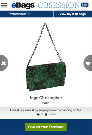
eBags swiped right on the idea and rolled out eBags Obsession in August, a Tinderfied version of its handbag category cooked up in its hack day.
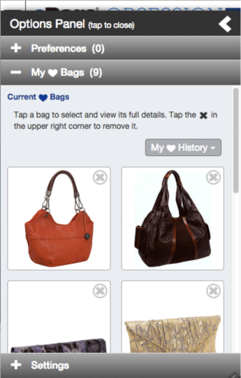
Rather than fumble through thousands of SKUs (eBags reports over 12,000), the customer can quickly scan through large images of handbag styles and build a list of favorites — much like flipping through a rack of merchandise in a store.
Their results weren’t too shabby: ten of the first one hundred users bought a handbag.
Leveraging data for personalization
eBags also uses this data to improve its algorithm, which already consists of one hundred factors. This data can be used to personalize to the user who’s played the “game,” and tune product recommendations and other merchandising across the site (collecting “people who like this tend to like that” feedback much faster than via traditional catalog browsing habits).
Mobile first means understanding mobile context
Though eBags’ site is responsive, the Obsession feature was created specifically for mobile devices, understanding that gestures and user context (quick, gamified experiences that are fun to do while waiting in line, etc) are important to the mobile experience.
When designing your own mobile experiences, remember that touch screens, gestures, geolocation, camera, shake/accelerometer, voice input, and push notifications are native to the mobile device. As such, considering them may improve your mobile experience.
Gesture conventions
Obsession isn’t the only swipe-shopping game in town: affiliate fashion apps Stylect, Mallzee and Kwoller use the feature too. However, as established online retailers, like eBags, adopt and promote the experience, it may catch on as a mobile shopping convention.
The key takeaway here is mobile experience must evolve to better suit device context. Adapting the online catalog to fit mobile dimensions may not be the optimal experience. Ecommerce merchandisers, designers, and developers need to keep a close eye on what’s trending in mobile behavior, and use that to determine how to improve the shopping experience.
Image credit: CC by Denis Bocquet


