What are the most frightening things that can happen in your checkout? These boners create all sorts of FUD that can fudge your conversion rates (Halloween puns intended).
- No persistent cookie
What’s worse than your older brother stealing your best candy? When an online store dumps out the contents of your cart while you’re not looking.
Online shoppers may take several visits before finalizing a cart. Forrester Research found 33 percent of men and 38 percent of women reported the last time they abandoned a cart, it was due to “not being ready to purchase.” It’s also common to use the cart as a functional wish list (it doesn’t require registration or log-in like most wish lists).
Persistent shopping carts hang on to the contents and save sales.
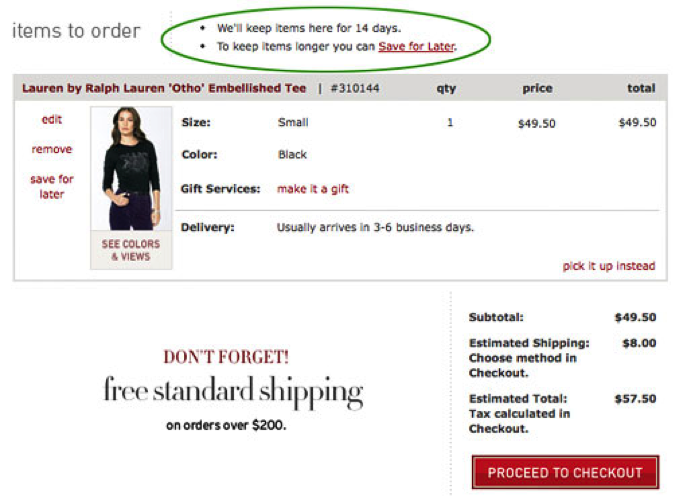
Some carts, like Amazon, keep cart contents forever. You may choose a shorter window, like 30 days or two weeks. Bonus if you let customers know how long you’ll hold cart contents.
Ideally, cart contents are preserved even after checkout is initiated and abandoned. And be sure to make it clear visually when products in cart are no longer in-stock, rather than removing them.
- No guest checkout
This is a long-standing usability best practice, as users generally detest slowing down their checkout process to register (approximately 25 percent will bail).
Sure, there are some cases where an ecommerce site must require registration and guest checkout is not a viable option, and 24 percent of the top grossing ecommerce sites require registration. But for the majority of checkouts, registration isn’t required, and the guest option should be flaunted.
Remember: signing into an account isn’t much better for returning customers, who often forget email and password combinations.
Think it’s enough to have guest checkout? Nope. Make sure to:
Tip 1. Call it Guest Checkout
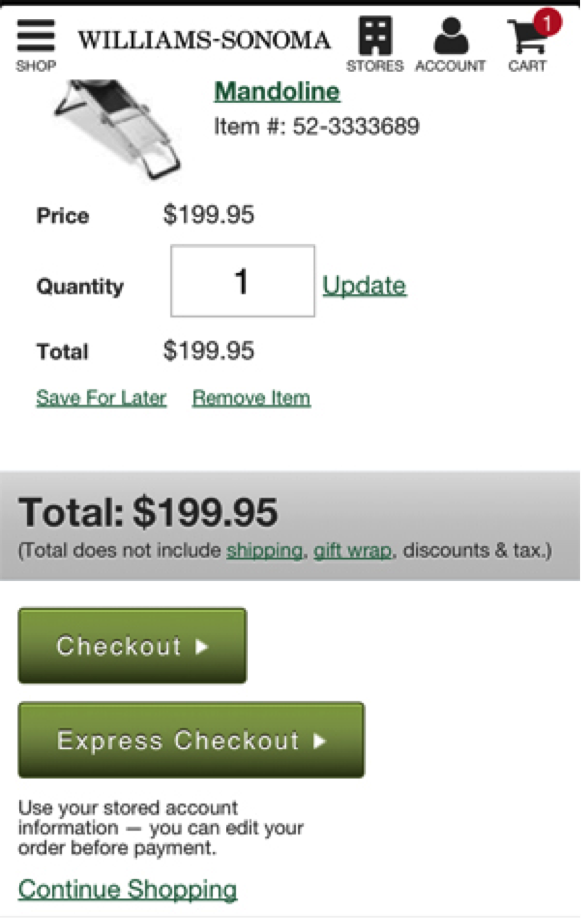
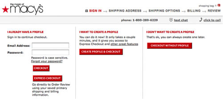
Forget labeling buttons “Checkout” and “Express Checkout.” It’s unclear which option is guest checkout, as guest checkout is intended to be faster than creating an account, but actually means “Sign In.”
There’s also no need for three options (Sign In, Create Account or Guest Checkout). Allow guests to save information after checkout, and let them know they can do so.
Tip 2: Show guest checkout first
Remember that web users tend to fill in empty form fields somewhat mindlessly, and user testing has found that new customers sometimes confuse Sign In areas as the first step if they don’t read carefully. It’s safer to assume the customer wants to check out as a guest, as even returning customers don’t remember email/password combinations. Don’t force them to.
Showing guest checkout first is also the better approach on mobile, as we covered earlier this year. Showing it second slips it below the “fold” in portrait mode, which may appear that you don’t offer it at all.
Make sure your guest checkout call-to-action is visible “above the fold” on various mobile devices, or simply skip all customers to your first checkout step.
Tip 3: Skip guest checkout selection altogether
Removing the Sign In/Guest Checkout step altogether fast-tracks everyone to guest checkout, with the option for returning visitors to sign in.
- Seemingly unnecessary required fields
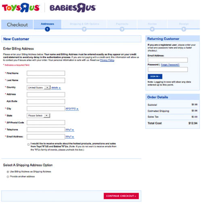
Worse than finding Sun-Maid raisins in your candy haul is required fields that seem unnecessary. Like raisins, they may actually be very good for you and serve a purpose (a telephone number for customer service purposes, for example), but without explanation they can really turn customers off.
The Baymard Institute’s research found that 61 percent of the largest ecommerce sites require such seemingly unnecessary information, and every single test subject complained at one point or another about a website asking for too much information.
However, test subjects were “quite forgiving” when reasonable explanations were provided proximal to the fields, or when the fields were simply optional.
PS: It’s a good idea in general to use form field descriptions. 92 percent of top online retailer’s don’t. A really important one is explaining CVV.
- Surprise charges
Too much info’s evil cousin NEI (not enough information) pre-checkout can also be frustrating. Providing shipping and tax numbers before starting checkout can help. Though it may not impact ultimate conversion rate, it shifts abandonment earlier into the process and eliminates a major variable from your checkout testing.
- Poorly designed mobile forms
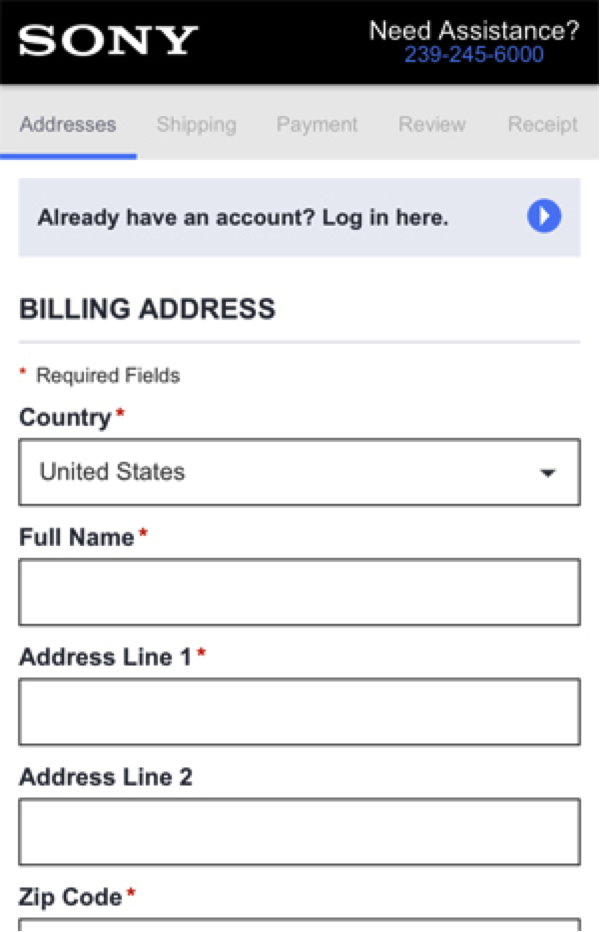
Mobile checkout has its own special considerations. Touch keyboards crowd an already tiny viewport. Pinching and zooming can leave a customer feeling lost in the process, as context like field labels and section headers disappear from view. Tab functionality doesn’t really work. Autocorrect can have a mind of is own.
Ensure you’re not making common mobile checkout errors like using inline field labels, placing tap targets too close together, overusing drop-down menus when radio buttons or open input fields would be more usable, etc.
- Lost credit card info
Because PCI compliance prevents websites from even temporarily storing credit card inputs on the server, most ecommerce sites (save those that have approval) must wipe credit card information when form errors occur.
Customers generally don’t understand this, they just think your checkout sucks like candy corn.
But fear not, there are a couple of workarounds suggested by Baymard Institute: offer a dedicated credit card step, which only clears contents when a card is declined (though it creates an extra step) or submit the form with AJAX, which eliminates the need for a page load and can retain the input.
- Unclear error handling
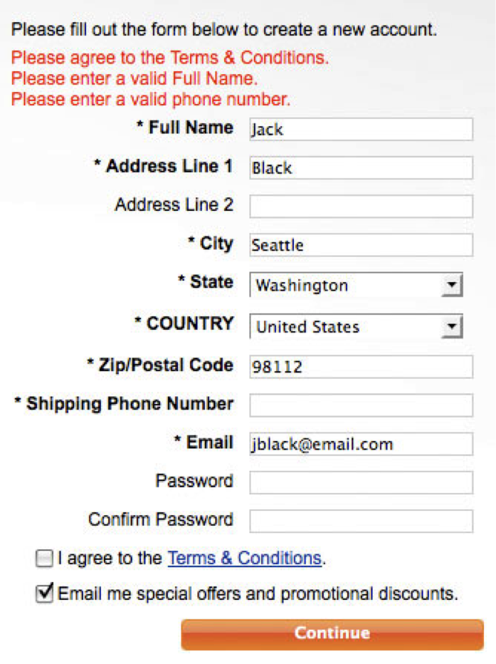
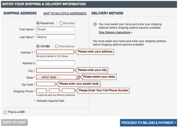
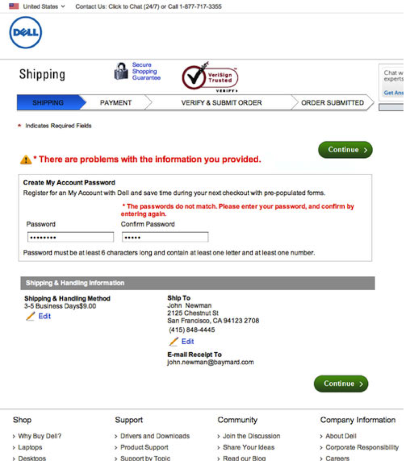
Nothing slows down checkout flow more than form field errors. It’s critical to make it very clear where errors occurred.
The wrong way is to list all errors at the top of the form.
It’s much better to highlight the actual fields that require attention.
Even better is to use inline validation, showing input errors after each field is completed (when the user tabs or clicks to the next field).
User testing by Etre and Luke Wroblewski found that inline validation decreased errors by 22 percent, increased satisfaction by 31 percent and decreased completion time a whopping 42 percent.
Alternatively, Baymard Institute proposes showing a new step containing only fields with errors.
Keep in mind, the above is only a mockup.
A commenter on Baymard’s post points out that removing other fields may be confusing to customers (especially those who have enough experience with form errors), thus it should be tested (of course). If a checkout uses inline validation, this might only be required when more complex lookups are performed, such as AVS and credit card validation.
- Card declines
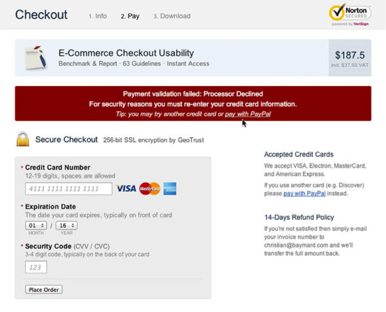
When a credit card is declined, for whatever reason (reasons rarely being offered to the merchant by the bank in real time), customers can be quite motivated to try a few more times, even with another card.
Even with the extra effort, an estimated 2-5 percent will ultimately abandon because of a declined payment method. But Baymard Institute has found a way to recover 30 percent of these abandoners with a callout to retry the cart or try an entirely new payment method.
- Sloooow performance
When you optimize your site for performance, don’t forget to tune the pages in your checkout flow and regularly test your checkout internally to catch bugs and hiccups in the experience (especially if your site is responsive!).
Would removing the cart contents summary from your checkout flow speed things up? Can you make fewer HTTP requests? Are your JavaScript tags loading after page content? Etc.
Remember, it’s perceived page load that provokes abandonment. Using AJAX in your checkout with “spinner” effects, for example, even for a fraction of a second, can trigger the perception that your process is slow.
And failure to properly prepare for traffic spikes, especially during holiday and promotional periods, can be the kiss of death.
- Not capturing an email address early
If you’re not capturing an email address early in checkout, you’re missing a huge opportunity to send cart recovery email.
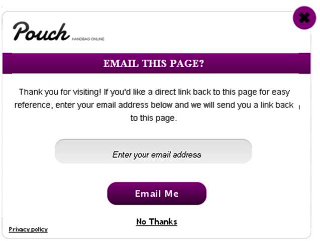
Even if you can’t capture an email address, there are a couple of ways you can remarket to cart abandoners: dropping a display remarketing cookie and serving an exit lightbox. (Hat tip to Charles Nicholls for sharing this tip with GetElastic).
This year, don’t let customers get ghouled again. Make sure you’re not making any of these grave errors in your checkout.


