Ecommerce site search is a critical touch point in a customer’s purchase journey. Those who use search have something specific in mind, and a failure of your site search tool to deliver the most relevant results in a user-friendly way can make or break your chances of winning business.
You may be familiar with general must-have ecommerce site search usability features, such as handling misspellings, providing filtered navigation and sort-by tools, using autosuggest and autocorrection, etc.
But what about making your results more contextual to the user? I recently received a review copy of Baymard Institute’s Ecommerce Search Usability report (May, 2014) and selected four optimization guidelines for contextual relevance to the user and search queries.
Include contextual snippets
Over half of Baymard’s test subjects encountered questionably relevant results — they simply could not figure out why they were returned. Contextual search snippets highlight matching keywords, like Google’s results, so customers can make the connection.
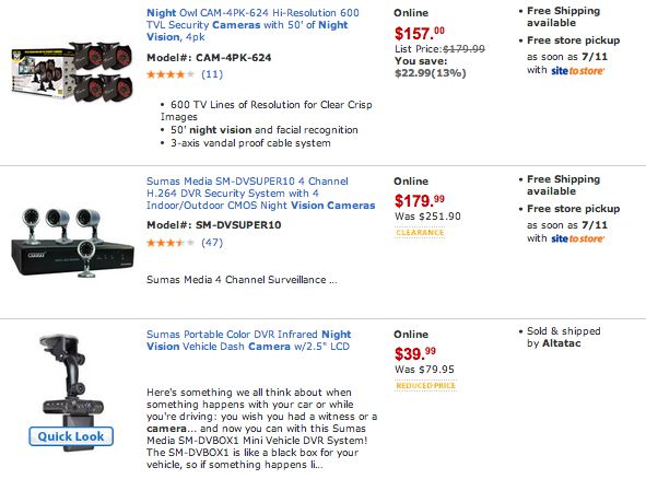
In this example from Walmart, a search for “night vision camera” highlights keywords in the title and pulls the appropriate snippet of text from the product page:
Contextual snippets provide visual feedback when a user sorts by price or “best seller” category, for example. It becomes more apparent when top results are not necessarily the most relevant matches.
Intelligently serve list or grid view
Baymard Institute’s user testing revealed that grid and list view perform better for visually-driven vs. spec-driven products, respectively, and worse when the opposite view is served.
This makes sense. Customers choose spec-driven products like electronics, appliances, wireless plans, software and wine (to name a few) most often because of function, not form. Grid view allows space for specs in SERPs.
Conversely, squeezing down thumbnails to accommodate specs for visually driven products reduces SERP usability and satisfaction. Both sub-optimal presentations result in pogo-sticking between search and product pages, a problem even more frustrating on mobile devices. (Both types can benefit from displaying star-ratings).
Let’s face it, even if you enable display toggling, customers are lazy. Better to do it for them.
If you sell a mix of spec-and-visually driven product types, you’ll need to use rule-based logic to dynamically match the better view to the user’s query. Baymard suggests starting with category scope (and suggesting scoped results in autocomplete to maximize the use of scoped search).
When the user does not select a category scope, base the default view on inheritance. In other words, match the product type to a default category.
Baymard also notes that in grid view, it’s more difficult to determine which products are most relevant thanks to multi-column layout. It’s more intuitive when “top results” are shown in stacked, list view. You may want to experiment with tuning certain query types that are either very specific, or for which relevance score drops off after the first few results.
Only two of the top 50 US ecommerce sites accomplishes this: Walmart and Amazon.
Personalize default search scope
An advanced move is to use profile information to personalize search results. Of course, this requires a logged-in state or other indicator of a person’s identity (or if you dare, other signals of customer segmentation or intent).
For example, Gilt can auto-scope results by gender.
It’s a good idea to always provide an override—customers can be shopping for others—and to make it very obvious that the results are scoped (this would be a feature to user test before A/B testing).
Baymard notes that for this to work, catalog items need to be grouped fairly distinctly, i.e. gender for apparel, business vs. consumer telecom plans, etc.
Dynamically match product attributes to query
If a query includes a visual product variation like color or pattern, it’s confusing to see mismatched thumbnails in search results. Our brains like to take shortcuts, and this erodes confidence in relevance.
For products that are not listed separately by color, it’s recommended to dynamically show the matching color in results, like Ikea.
This is especially helpful when matching items may vary in the shade of color queried.
Ideally, products for which the color variation is no longer available should be dropped from results. Walmart misses this, but wins for effectively displaying the exact same results when searching for “crimson jackets” as “red jackets.”


