No marketer wants email subscribers to defect, but if and when a subscriber wants to opt-out, it’s best not to resist. Not only will your engagement metrics rise by letting the no-longer-interested go, it keeps up your list hygiene and reduces the risk of subscribers marking unwanted messages as spam, which can hurt your sender reputation and deliverability across the board.
To conclude our 3-part series on retail email, today’s post covers how to optimize the unsubscribe process.
In-email calls to action
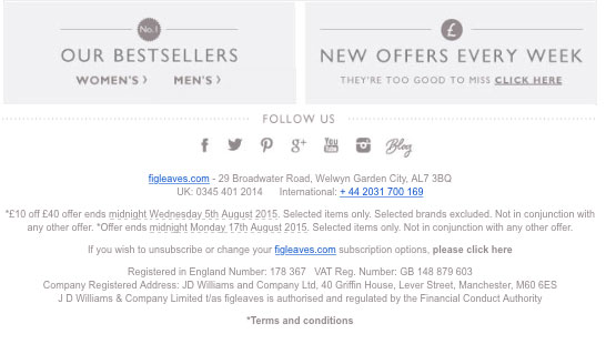
Make the unsubscribe link easy to find. Conventional placement is at the bottom of each email message as an Unsubscribe link — that’s where most subscribers will look for it, scanning for the trigger word “Unsubscribe.”
Though it’s tempting to bury the link by either making it not look clickable, or placing it within a paragraph of text, this plan can backfire. You don’t want subscribers marking your messages as spam.

Some clients, like Gmail, offer “Unsubscribe” links in the pre-header. But when a subscriber uses the email client’s unsubscribe option, you lose control over the experience and the ability to take advantage of the tips that follow in this article.

Avoid using any other labels than “Unsubscribe.” Don’t assume non-marketers will understand that behind “Manage Preferences” lies a way to unsubscribe!
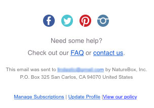
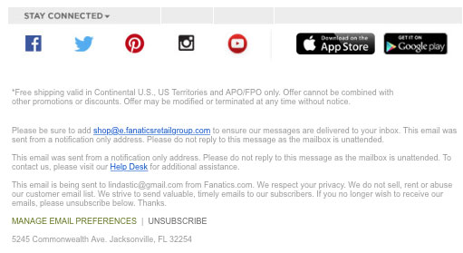
Better practice is to put both “Manage Preferences” and “Unsubscribe” adjacent to each other.
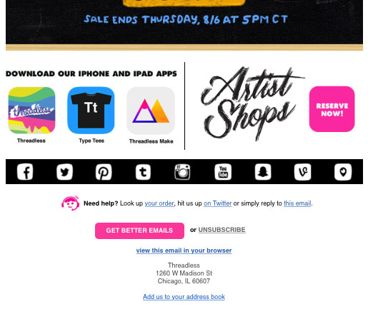
Even better, use the label “Get Better Emails” it’s more easily understood. Styling this CTA as bolder than Unsubscribe may also be more persuasive, and may win some unsubscribers that simply want to reduce frequency or improve relevance.
Unsubscribe landing page
Many “Unsubscribe” links lead directly to a preference center landing page. Again, subscribers may not understand preference centers, and may be confused or off-put by landing on a complex landing page when they simply want to be removed from your list. Landing pages should always match a user’s expectation.
What not to do
Western Web users scan a page starting at the top left. In this example, the user is asked if he or she wishes to update the email address. This is a highly unlikely scenario, the user clicked an unsubscribe link.
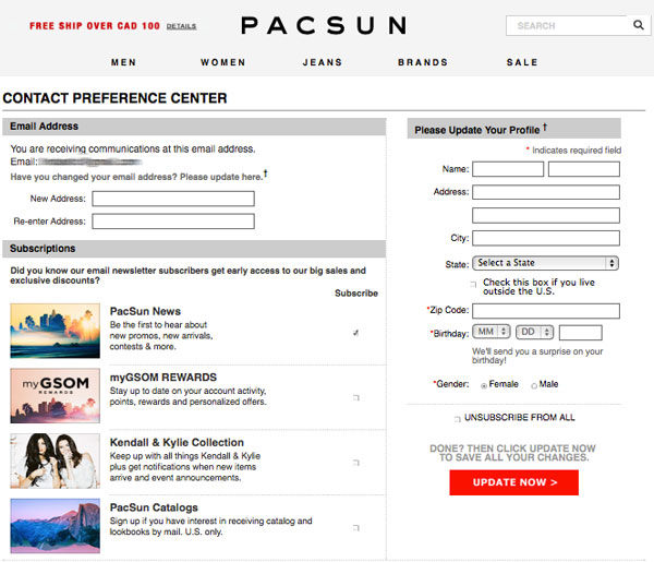
Likewise, asking this user to subscribe to more publications, or provide more personal information is irrelevant and inappropriate for this task. This landing page is simply asking for too much, and burying the goal. The Unsubscribe CTA is difficult to spot.
The following example doesn’t provide clear instructions, and suggests the user can choose from multiple “publications” when only one is presented, adding to the confusion. (If you require instructions, your unsubscribe process is too complicated).
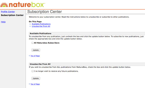
Another caveat with Preference Center landing pages is they push calls to action below the fold. (Remember, Web users typically don’t read your carefully crafted explainer text, they look for colorful button-looking things to click).
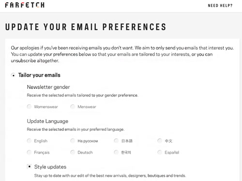
At a glance, it’s unclear Farfetch’s Email Preferences page includes an unsubscribe option.
Land’s End’s headline “Wait, Please Don’t Go!” is more effective. It implies that the user has successfully reached an unsubscribe process, and provides an option to control frequency.

However, above the typical laptop fold, the CTA is “Save Changes” without an opt-out-of-everything option. The user may not intuit to scroll below to find the Unsubscribe button. Ideally, all options would appear above the fold (especially on mobile devices).
What to do instead
Wayfair achieves all content above the fold.
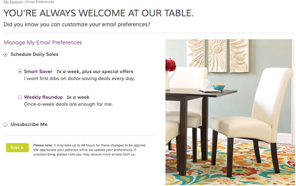
While the Preferences Center approach is very popular and provides the opportunity to “save” the subscriber, an alternative approach is the “are you sure” interstitial, where you can use a bit of persuasion, repeating the value prop of remaining a subscriber.
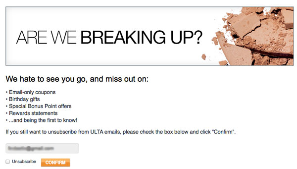
Post-unsubscribe
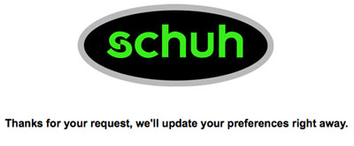
The alternative to sending the user to a preference or are-you-sure landing page is simply executing list removal as requested, and providing a clear confirmation to the subscriber.
If your list removal takes a few days to process, or you send a final confirmation email, ensure this is explained.
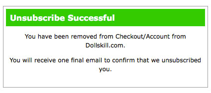
Including an undo option is helpful in case the subscriber has second thoughts. Ideally this re-subscribe call-to-action is paired with a blurb that reinforces what they’re missing out on.
However, simply confirming unsubscription misses opportunities for other types of engagment, much like a dead-end post-purchase thank you page.
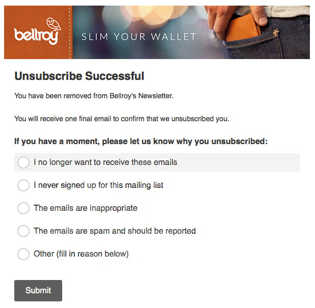
Consider asking for feedback that can help you improve your mailing strategies (only after unsubscribing).
You may also suggest following your social profiles as an alternative to email.
A little humor doesn’t hurt, either…
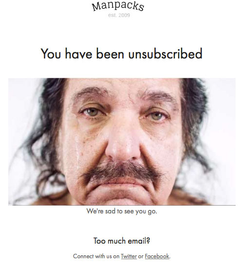
Image credit: CC by Joe the Goat Farmer.


