When juggling all the responsibilities of a freelance web designer, it’s common to worry most about things like writing a contract, getting paid, and actually building the website. Sometimes, however, communication between the designer and the client is the trickiest part to get right. Especially early in a project, before there is a prototype or mock up to share, it’s easy for designers to wonder what to share with clients and how often, when to be an open book and when to keep to themselves.
What do I show my clients? What do they want to see? Do they even care about my work process?
Sharing during the user experience design process gives designers clear checkpoints for pausing to communicate with clients. These five user experience design deliverables play double-duty. Not only do they give clients a way to understand the time and effort that goes into UX design while keeping clients and designers on the same page, but they also keep designers on track. When you share your UX design process, you force yourself to plan well at the beginning of your project. When you’re elbow-deep in developing your site, you’ll have a clear foundation to build on.
User Personas
 Use a simple list of questions to dial in on your client’s ideal user. Even if clients want to target a broad audience, describing (and even naming!) ideal site visitors helps to focus the entire design process. If your ideal user is a 45-year-old fisherman named Henry, you’ll want to have that in mind before you design a site that markets to 25-year-old accountants named Jill. Communicating with your client as you produce user personas means that both designer and client are on the same page about the site audience.Click for more ideas about defining user personas.
Site Map & User Flow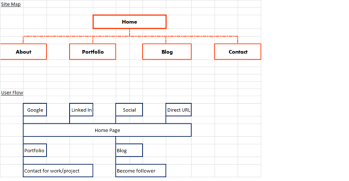
Whether you use cool software like Gliffy or get out a pen and paper, a site map and user flow help determine early on what actions users should take when they arrive at your client’s site. Before you get too deep in your design, it helps to clarify with clients that the desired end goal is the sales page and not the social media page, for example.
Site maps and user flows also force designers and clients to think about how users arrive at the site and where they’ll go next, meaning that you can design your site knowing where content will be featured (and why). Planning for users to arrive on a mobile platform or via blogpost, for example, will make a difference when it comes to designing the layout and organization of the site.
Site Map & User Flow, Lisa Crawford, Skillcrush Web Design Blueprint June 2014
Wireframe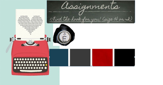
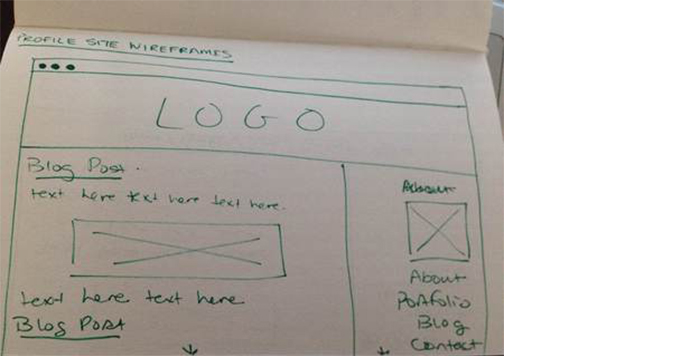
Showing your client a visual before you get into the nitty gritty of design can save you a lot of hassle down the road. After designing a 13-column, responsive grid-system, do you want to find out that your client has recently decided that’s probably unlucky? Draw a wireframe in a notebook and take a snapshot to share with your client, or use one of these fancy tools.
Wireframes, Terri Cole, Skillcrush Web Design Blueprint June 2014
Mood Board
Have you ever had a client tell you he or she wanted a site that was “edgy, yet safe, but also cool and blue, but not icey or hospital-y?” Me too. A mood board is a great tool for stopping to check that your idea of the site’s look and feel matches your client’s. Click here for tips for implementing mood boards.
Mood Board, Margaret Fajardo, Skillcrush Web Designer Blueprint June 2014
Type Scale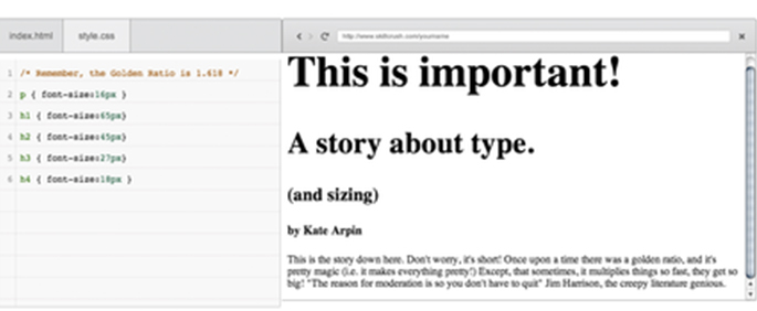
Creating a type scale is an often-forgotten stage in the design process. Selecting your brand color and font is important, but you want to make sure your content is readable. Instead of using standard font-sizes, creating a modular type scale that defines font sizes based on a ratio and scales them according to screen size means a lot less work down the road. It’s a good idea to share a type scale with your client as well, especially if your client is concerned about readability. Doing the work upfront means a lot less tinkering later. Here’s a great tutorial for setting a type scale.
Type Scale with The Golden Ratio, Kate Arpin, Skillcrush Web Design Blueprint June 2014
Typesetting, Fiona Casella, Skillcrush Web Design Blueprint June 2014
Bonus! Early prototype
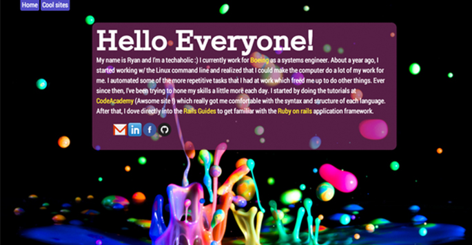
Some designers prefer to show clients finished, polished products. But snippets, like screenshots of a homepage, can give clients an idea of the direction a site is going. It sure beats building a whole site before learning that a client has an issue with “the whole site organization”!!
Site Prototype, Ryan Graham, Skillcrush Web Developer Blueprint June 2014


