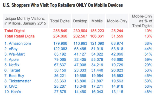
There’s a customer segment you need to pay attention to: the mobile-only shopper. ComScore says it’s 13% of US Internet shoppers.
13 percent of Internet shoppers, no big deal, right?
No big deal until you see the the percentage of mobile-only shoppersamong top 10 online retailers (via Search Engine Land):
Note the number that exceed 50 percent of mobile-only visits, or come very close.
And a study by xAD/Telmetrics found 42 percent of mobile users consider mobile the most important resource in their purchase process.
Think mobile shopping is still nascent?
Optimizing for the mobile-only shopper
Though Google found 67 percent of online shoppers use multiple devices throughout their shopping journey, ecommerce professionals should treat the mobile-only segment seriously, and ensure the mobile experience supports them fully.
Nail basic mobile usability
Forget mobile as simply a “research touchpoint.” Smartphone-only shoppers need to be recognized for their full conversion potential. Never consider your smartphone site as merely a research tool, ensure it’s usable from entry page through checkout. Make it easy to navigate and search, optimize images and copy readability, make it easy to save and retrieve items in wishlists and carts, rigorously test your cart process and form usability, etc.
I’m amazed at how many mobile commerce sites not only have confusing navigation but forget the little things like “return to category” links after items are added to cart, “more like this” merchandising and breadcrumb navigation.
Forget matchy-matchy
Who says your mobile site has to look like a mini-me of your desktop experience? Do what’s best for your growing mobile user base.
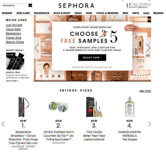
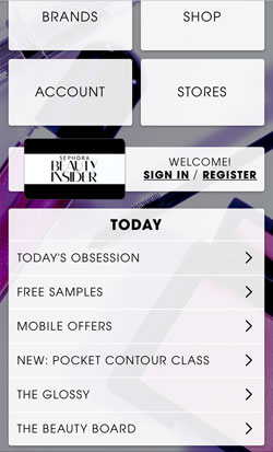
Sephora gets it. Desktop has more room for fancy merchandising and carousel heros.
Mobile’s more about completing tasks. What did you visit the site for today?
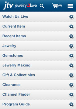
Many mobile sites started off as simple menus. This may or may not be the most effective approach for every site, but it’s a valid design that you should test.
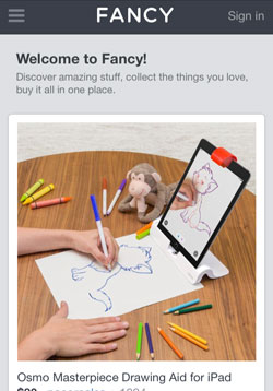
Other sites like Fancy are moving towards a mobile-first design, where everything scales up from a very mobile-friendly and mobile-trendy design.
Leverage geotargeting
The smartphone has this nifty little thing where it can detect a user’s location — but it’s your choice to use it. Don’t be shy to ask for a user’s location to enhance merchandising.
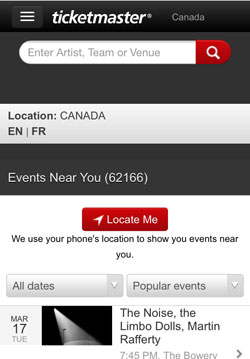
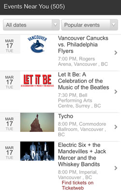
Not only is it helpful for sites like Ticketmaster that sell local products, but also for brands with physical shops to support customers that use mobile to research offline purchases.
Even if you’re an online pureplay, consider using geo-personalization to rank search and browse results based on what’s available locally, or based on geo-rules that consider purchase trends.
The larger your catalog, the more impact geo-personalization will have. As page views can take longer to load, there’s less screen space to scan search and category grid pages, etc. When it comes to the best mobile experience, you want the most relevant content and products to rise to the top.
Support returning visitors
Personalizing returning visits based on what was viewed last session, referral campaign or what’s in the cart is another way to aid navigation and discovery. And again, the larger your catalog, the better this feature will be.
Incentivize the Log In
While you can recognize returning visitors through browser cookies (many smartphone users are opted-in to first party cookie acceptance by default), ideally a customer is logged in as much as possible, so you can personalize based on profile information and past behavior.
A smart way to encourage registration and login is to build app-like features that are engaging and that result in content that customers want to save. Take for example eBags Obsession, a Tinder-like way to discover and bookmark handbags quickly using swiping gestures rather than menus.
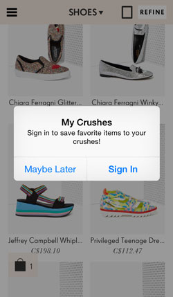
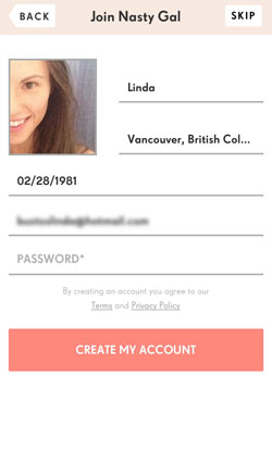
Nasty Gal uses drag-drop functionality to create “crushes” lists of favorites, and to add items to cart.
But to use the functionality, you gotta sign in!
To reduce friction, Nasty Gal supports social sign on, making registration super easy and more like joining a social network than a commercial site.
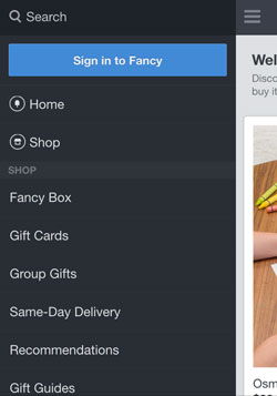
Another tip is to treat sign-in as a primary call-to-action. Fancy, for example, makes it stand out as a main navigation item.
If you have a loyalty program, remind customers to sign in by baking it into the middle of home page design, as in the Sephora example above.
Promote your app
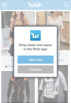
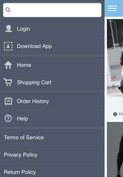
Retail apps aren’t dead, they just need a little help. Though most shoppers don’t want to download and use your app, if you have a passionate mobile user base and can clearly communicate the benefits of downloading your app (faster, extra features, in-store features, etc.), promote it wherever you can.
For example, overlay:
Or baking into mobile menus:
Support offline purchase
ComScore’s research measures “mobile only as a percentage of digital,” but doesn’t track what number of these customers are omnichannel‑ using both mobile and physical channels. We know 81 percent of smartphone owners use them in-store, often to showroom or reverse-showroom.
Reverse showrooming is also known as “webrooming,” and for mobile-only users, you might dub it mobrooming?
Consider WalMart, Target, Best Buy and Kohl’s, all with 40-50 percent mobile-only digital customers. Surely a portion of these are using digital to support physical shopping. How do bricks and clicks retailers support mobroomers, who use digital to research purchases with intent to purchase in-store?
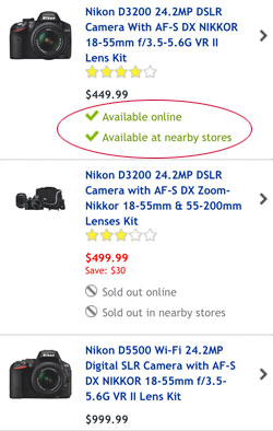
- Use geotargeting to show local promotions, local pricing, local stock availability and store locators (example, Best Buy):
- Support wishlist and shopping lists and bake wayfinding tools into your mobile app.
- Participate in Google Local Inventory Adsprogram.
- Make product reviews easy to retrieve on product pages. If possible, support product scanning (beacons, QR codes, etc) to quickly pull this information.
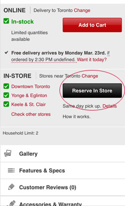
- Make reserve-and-collect features prominent on product pages, when available (example, Future Shop):
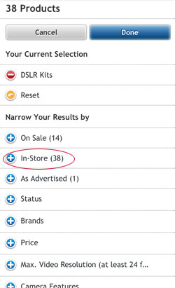
- Support filtering search and category results by local store availability (example, Best Buy):
- Consider using visual search in your mobile site or app.
There’s no going back — make sure your digital experience is ready for the “mobile only” customer.
Image credit: CC by U.S. Department of Agriculture


