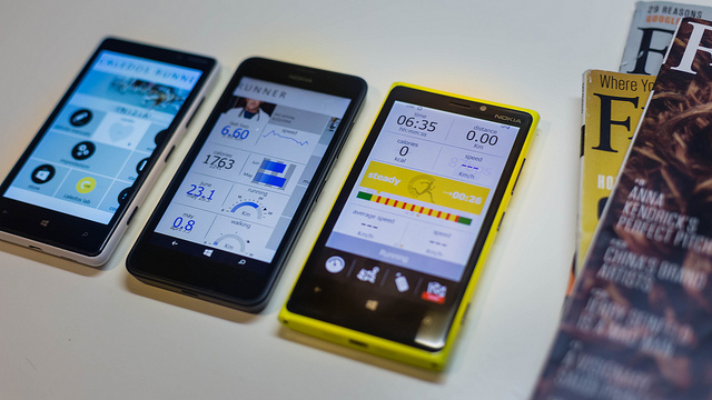
“Oh, and of course it should look great on mobile.”
It was the end of my meeting with a brand new client, and we were about to wrap up our video call. We had spent an hour outlining exactly what he needed for his site: a Twitter feed, a page to showcase his freelance work, and even a feature to make it easy for clients to book his services.
At the end of our call, he tacked on that bit about mobile design.
It’s not the first time that’s happened. A lot of the time, a great mobile design for a new website is both implied and an afterthought.
We expect sites to look stellar on our phones, phablets, tablets, and TV screens—and that makes sense! It’s 2015, for crying out loud!
But when we think about our websites, we imagine them appearing first on desktop monitors and laptop screens and secondly on mobile devices, instead of the other way around.
Did you know that nearly 7 billion people in the world (95.5 percent!) have a mobile subscription (Mobiforge)? And with 60 percent of pageviews coming from mobile devices in 2014, more and more of those people are visiting sites on their mobile devices rather than on desktop screens (Small Business Trends).
That’s why it makes sense to make killer mobile designs a priority.
The mobile version of a site can make or break a business. Think about it. If you’re visiting a new city, Googling nearby restaurants, are you more likely to visit the Italian café with the easy-to-navigate menu and contact info, or the dumpling place with a mobile site that takes 5 minutes to load and has the tiniest font known to man?
Great! So mobile design is trés important. If you’re new to code, building a sleek and functional mobile site is probably pretty intimidating. But it doesn’t have to be! After all, if you’re a mobile user, you’re the ideal customer—you know what makes a mobile site a pleasure to visit (and what makes it a frustrating nightmare!).
Still, it’s helpful to have some guidelines to start from. Here are eight elements of amazing web design to keep in mind every time you build a mobile site.
- LARGE BUTTONS
No one wants to feel like their fingers are too big, and what is more frustrating than trying and failing to click a button? Big buttons guide users toward an action, so if you want someone to buy something on your site, a large “Buy Now” button makes sense. If you think your users are there to order something online, a “Place Order” button can draw their attention.
- MINIMALISM
When users visit mobile sites, they probably don’t need to see ALL of a site’s content. The best mobile designs distill content down into its most minimal form. Feature the most important things you want your users to land on, and hide the rest away (either on the desktop version of the site or in hamburger or slide menus).
- NEGATIVE SPACE
It’s easier to find what you’re looking for on a mobile site if there is a lot of empty space. The best mobile designs don’t fill every nook and cranny of the screen, but leave white or empty space to showcase important features (like buttons!).
- INTUITIVE DESIGN
Most smartphone users are accustomed to functions like swiping right to go to the next page and double-tapping to zoom in. Great mobile designs take advantage of these intuitive ways of interacting with a device.
- LOGICAL FLOW
When you visit a mobile site, chances are, you have a specific purpose. The best mobile sites include a couple logical paths that users can follow, so that if someone visits a site to find a contact number, for example, it only takes a few obvious steps.
- INTEGRATED
Mobile users usually have a lot more going on than just a web browser. They move quickly between social media, email, and camera apps, for example. The best mobile designs make it easy for users to jump from the site to an external app, like Twitter or Calendars, for example.
- EASY TO NAVIGATE
Mobile screens are small (obviously), and getting around them is a lot different than clicking buttons on a mouse. The best mobile design layouts make it easy for users to move throughout the site, either by using intuitive movements (like swipes and taps) or by including arrows and menus that guide a user through the site.
- FAST
Look, mobile users are in a hurry. The best mobile sites aren’t bogged down with too much information. Users don’t want to wait around for a bulky, overburdened site to load. So make sure image file sizes aren’t huge, and that the CSS is optimized.
Image credit: CC by N i c o l a


