While personalization engines track search and navigation behavior to determine the most relevant content to a site visitor, a lesser-known tactic is to use filtered category and search results to provide more contextually relevant product lists.
In E-commerce Usability: Product Lists & Filtering, Baymard Institute explores five guidelines for personalizing product lists based on their own lab user testing experience:
- Include List Item Information Based on Applied Filters and Sorting
Product lists typically include image, name, price and, if you’re lucky, star rating. Too often the product attributes that matter to the customer’s decision hide behind these links, resulting in guessing and pogo-sticking behavior (viewing products, returning to results, over and over and over).
Remember, this kind of hassle is even more frustrating for customers on mobile devices.
Filter options are sometimes absolute (e.g. color, size or brand), but often are a range (e.g. price or TV screen size). When a filter uses a range, it’s great usability to pull the attribute detail into results.
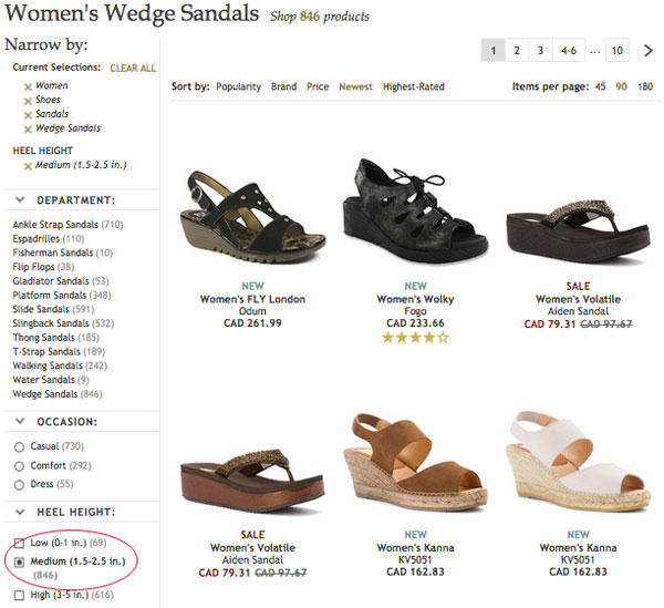
This is a dilemma I encounter when shoe shopping. Some women with ankle contractures, like myself, require an exact heel height. In my case this is 2.5 inches. I appreciate sites that allow me to filter by height to at least narrow the thousands of results down to hundreds, but I still have to pogo-stick forever to find styles that are exactly 2.5 inches.
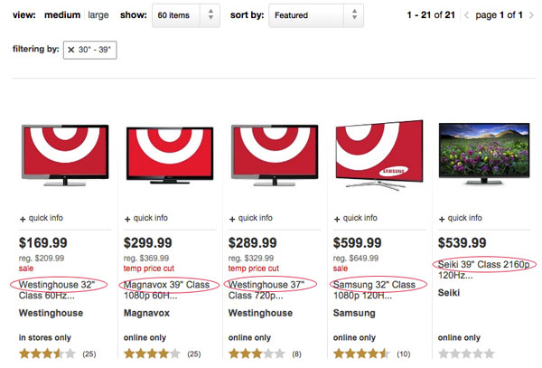
While I haven’t encountered a shoe site that supports exact-height search or browse, there are a few examples for other types of products. For example, how Target displays results for TV screen sizes:
When filtering results by screen size, the customer can see at a glance the difference between items. This is especially useful since the product images look very similar.
Another common filter is percentage off, typically a range of 20% and more, 30% and more, 40% and more, etc.
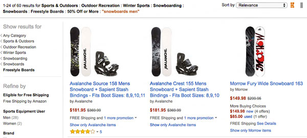
Amazon, for example, allows you to filter by discount tier but doesn’t call-out the discount.
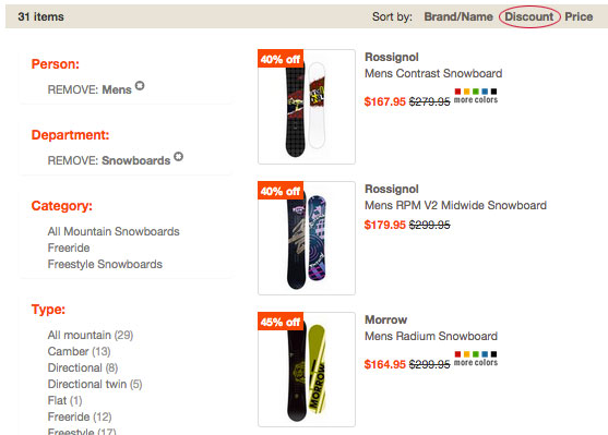
Altrec trumps Amazon, not only showing the percentage off badge right on image thumbnails, but also supporting sort-by discount.
Says theBaymard Institute report:
“In order to provide the user with direct insight into product aspects they’ve expressed interest in, sites must dynamically include product specifications (i.e., the product aspects) based on the user’s applied filters and sorting (i.e., the user’s interests).
Luckily this isn’t as tricky as it might seem at first, since the data is already structured for filtering and sorting in the first place. Selectively including it in the individual product list items is then simply a matter of detecting which filters are enabled and including those respective values in the list items.”
2. Context-Aware Product Thumbnails
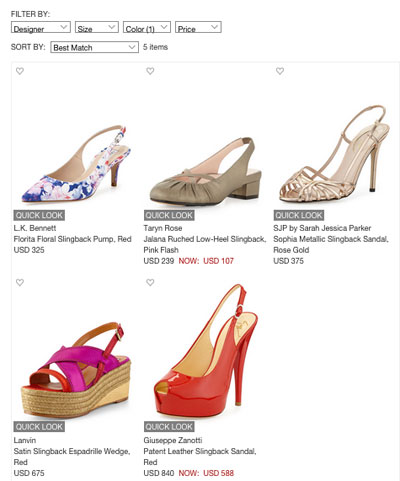
Matching thumbnail images to search or filtered context is another personalization plus. Let’s use a shoe store example again. When you filter shoes by color, the thumbnails don’t match the filter at Nieman Marcus:
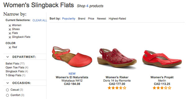
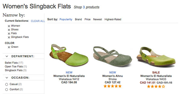
Shoes.com swaps the thumbnail images based on filters:
Other filters that benefit from image swapping are flavor, size, bundle/value pack or any attribute that requires an image on a product page.
3. Contextual Compatibility Notices
Brand and product-compatible accessories should be easily filterable and called-out in product lists. Baymard’s testers frequently had trouble finding compatible accessories from list pages, often forced to read product descriptions to verify compatibility or use product finder wizards.
While wizards are a great way to help customers find compatible accessories, you can go the extra mile to infer the compatibility choices based on search box queries and items in the cart when the customer navigates to accessory category pages. If compatible filters exist, ensure the results call out the compatibility in the description snippet visible on the list page.
The Baymord report offers this recommendation: “Perhaps the most straightforward way to adapt list items with compatibility notices is to base them on the user’s cart contents. So if the user has, say, a 13-inch laptop in the cart, the list item of any computer bags and sleeves compatible with that laptop can be altered to include a small message stating their compatibility. If the user has multiple items in the cart, multiple notices could potentially be displayed”.
It’s noted that automatically including this context is a supplementary way of using your product compatibility database, but it can fail due to false or irrelevant detection, and shouldn’t be used as a replacement for compatibility filters and product finders.
4. Consider Indicating Sub-Values of Selected Hierarchical Filters
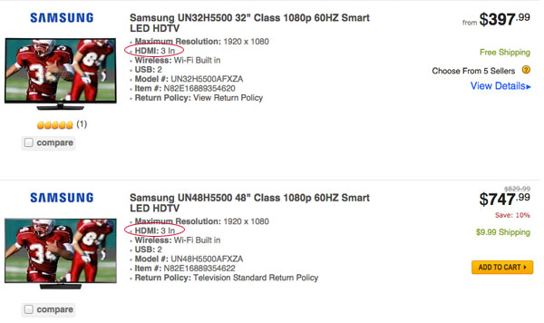
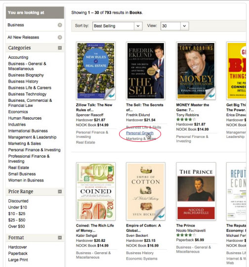
Baymard proposes that showing sub-categories in listing results aids customers’ refinement. Only one site Baymard tested adhered to this, Newegg. For example, if a user filters by number of HDMI 3 In, it’s visible in results.
Baymard also mocks up what Barnes and Noble could look like if they included sub-category links with product thumbnails. Not only does this provide scannable context, but also an additional way to filter results.
5. Highlight Any Product Already in a User’s Cart
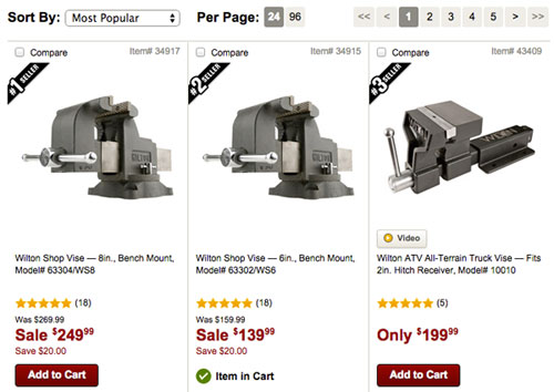
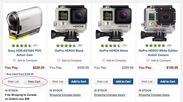
Baymard notes it’s helpful to indicate when an item already is in the cart, as test subjects who continue shopping had “a surprisingly difficult time refinding their items…because they looked like all the other items in the list.”
The report suggests allowing the user to adjust quantity of in-cart products from the list, or including links to related products.
Two sites that use this are Northern Tool and B&H Photo.
These are just five of the ninety-three guidelines for product lists and filtering in Baymard Institute’s original research. Read the full report for more information.
Image credit: CC by Ged Carroll


