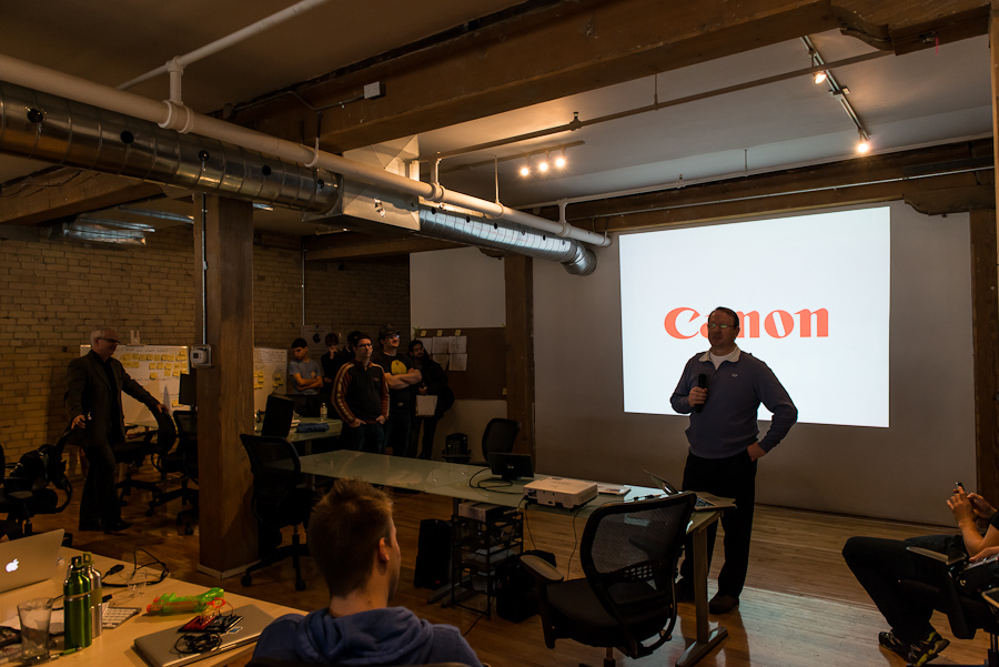
Great entrepreneurs with great businesses frequently find themselves facing Repetitive Investor Pitch Rejection (RIPR) from investors who don’t offer a clear or credible explanation why. This is a serious condition which can be fatal to your startup.
If you’re sure you have checked all the boxes (team, product, market, financials, traction, problem, competitive advantage etc. etc.) then it’s likely that your pitch failed for one or more of the following reasons:
- You Sucked When You Pitched. Anxiety often results in the real entrepreneur being left outside the meeting room while an unconfident, uncharismatic and unpersuasive robot delivers the pitch in their place.
This is normal but unhelpful. It goes without saying that you need to have practiced your pitch (full rehearsals not simply in your head) numerous times until you know your pitch inside out, back to front and and upside down and are able to move back and forth without missing a beat.
You also need to make sure your body language is congruent with your verbal messages and conveys confidence and authority. Body language has much greater impact than the spoken word and will always trump what you say. Do you know what messages your body is sending out when you pitch?
Given that people make decisions on emotion first and that ‘likeability’ is one of the most important factors in positively emotionally engaging your audience, then you need to make sure your winning personality is present. Most investors are concerned they are backing the right team over and above the product.
- Your Pitch Sucked. It is not enough to provide accurate, detailed information to your investor audience when pitching. You must engage, not simply educate. You need to inspire, not just inform.
If you are not delivering a well structured pitch that engages, excites, inspires and persuades your audience, through times tested techniques such as story and ‘aha’ moments, then you’re selling yourself and your startup short.
- Your Deck Sucked. Design is more important than ever and it isn’t limited to your product or website. If your deck is text heavy and inspiration light, then your chances of keeping your audiences’ attention are reduced.
People cannot effectively read and listen at the same time. If your audience is listening to you then they are not reading the text on your deck and vice versa. Your deck is there to support, not replace you. Use stunning graphics that support and reinforce your verbal messages but don’t require focus or attention. Use text sparingly and never use clip art.
These are some of the things you must work on when preparing your pitch. How much time did you spend on them the last time you pitched?
Photo Credit: CC by Evgeny Tchebotarev


