Nobody likes to cut an email subscriber loose, but when someone wants to go…you gotta let ‘em go.
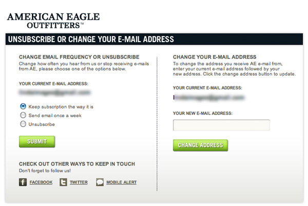
But it doesn’t mean the customer relationship is over. Some email defectors may simply just want to reduce their inbox clutter. A common tactic is to ask if the customer wishes to reduce the frequency of your emails, and many marketers remind customers that they can alternatively stay in touch through social networks.
Mobile alerts, though more invasive, are another alternative, as are calls-to-action to download an app.
It’s important to keep in mind that the design and optimization of your unsubscribe pages should not be treated as an afterthought. Usability, clear and persuasive copy and calls-to-action matter.
- Keep it short
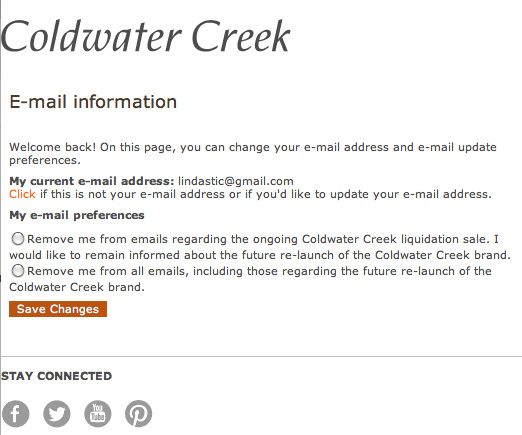
Avoid wordy options like Coldwater Creek’s. Here the subscriber has to figure out which is the actual unsubscribe option by reading. every. word. What’s going on here? Liquidation sale and brand relaunch? Keep it simple, smarty. Don’t try to confuse.
- Keep it clear
Label your main button accordingly. Use the word ‘unsubscribe’ rather than ‘save changes’ (as above) or ‘update’ to instill confidence that the customer has indeed unsubscribed.
Your social buttons should also stand out. Coldwater Creek’s gray icons don’t look clickable and don’t attract eyeballs (and placed below and eye-stopping horizontal line, oh my!)
- Ask for action
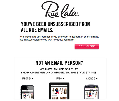
Rue-la-la shows some personality, keeping the tone friendly and playful, and including a call to action to continue shopping. Asking “not an email person?” informs the customer that the app is an alternative way to keep in touch. (Hey, it doesn’t hurt to try).
While you optimize your unsubscribe process, make sure you’re also looking for ways to get more email opt-ins.
Image credit: CC by Bruno Girin


