Humans are creatures of habit.
No matter how spontaneous you believe yourself to be, psychological evidence proves that habit formation is an essential aspect of our psyche. This isn’t necessarily always a bad thing, either–as Dr. Kelly McGonigal says in Psychology Today, why struggle through something when you can make it automatic?
As with anything else in our lives, whether that includes making a sandwich or your daily work routine, social media habits form easily for those accustomed to working with social media on a regular basis—or for those who couldn’t be bothered. And for both personal and business users, Facebook certainly challenges any creature of habit with the consistent technological renovations and aesthetic facelifts to the platform itself.
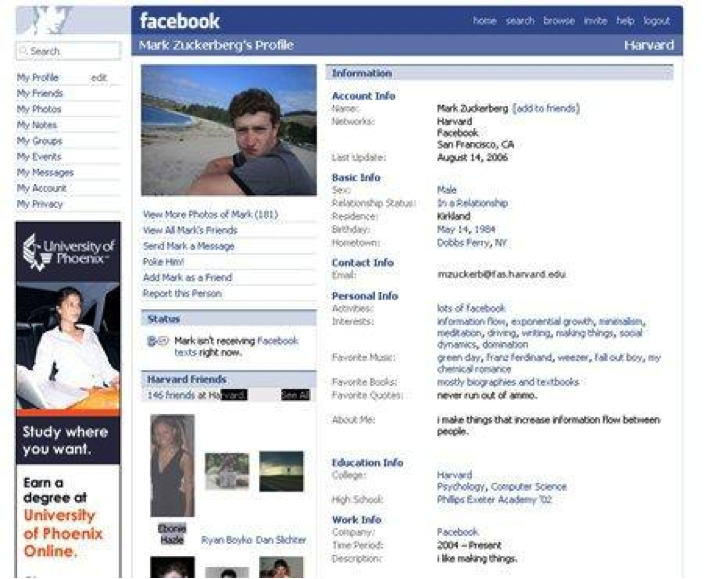
Early adopters in 2004 remember something that looks like this (Facebook screenshots courtesy of Devils’ Workshop). First titled ‘TheFacebook,’ at this point, the platform was open only to select schools. With simple, straightforward design and information, it was such a pure, basic essence of what social media would become.
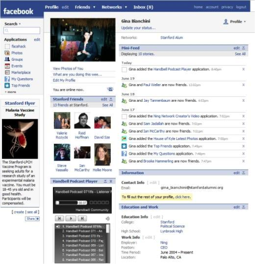
The 2006 updates included more information and a more similar format to the final layout, still primarily defined by school or association. And look at that! Target ads began to appear on the side of the page.
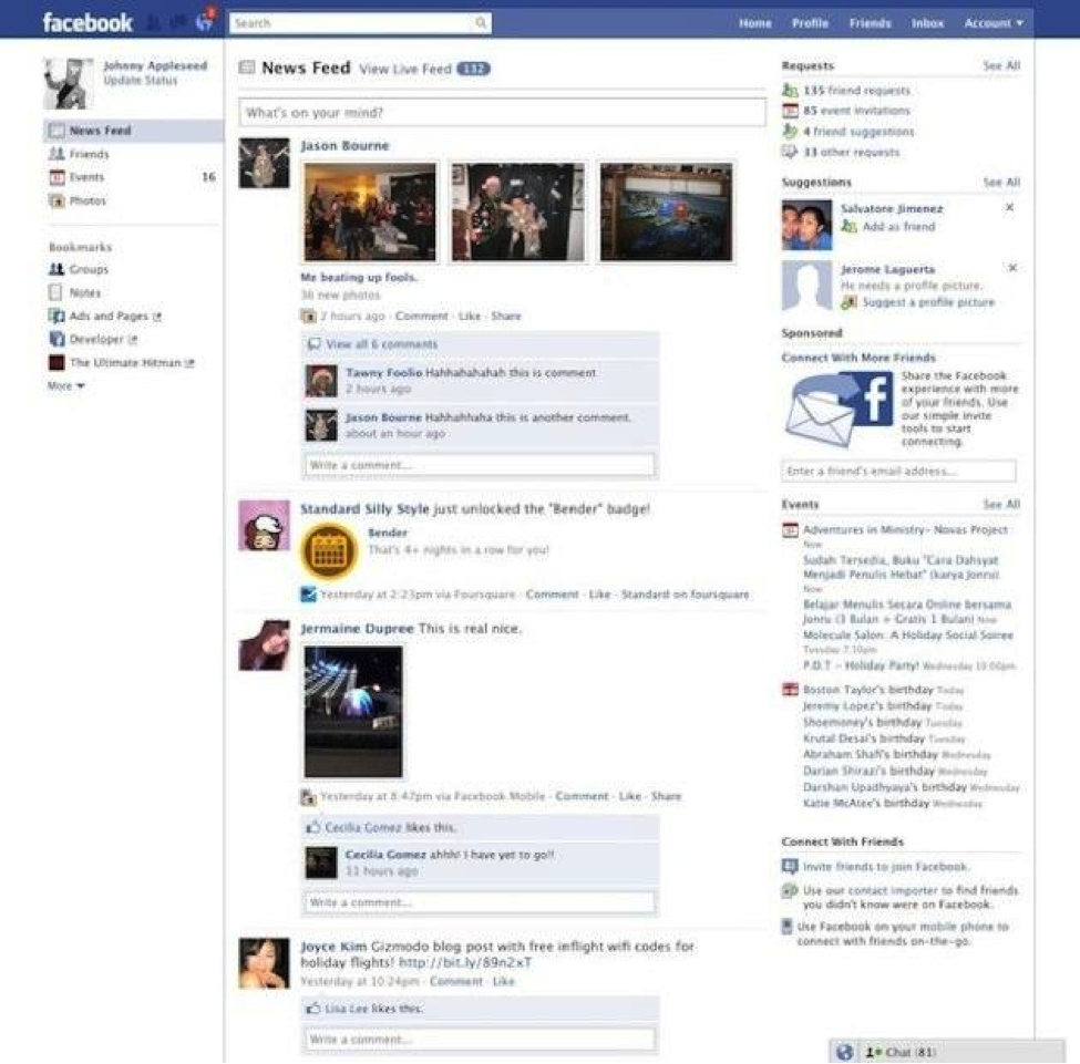
From 2007-2008, statuses and walls made their appearance. Applications and games were easier to add and be seen, and the inbox feature made its way to the header. Icons for photos, groups, and more developed into a colorful mélange that was a bit more interesting to look at than previous versions. Ads remained on the side of the page.
In 2010, notifications began to appear on their own page.
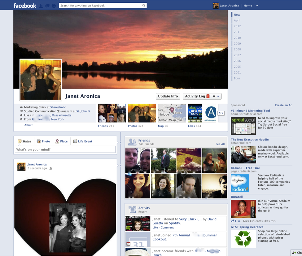
And in 2012, the controversial timeline made an appearance! Designers and anyone interested in aesthetics loved the new cover photo while others worried that the ease with which old information and embarrassing posts could be found was cause for alarm.
Next up? The 2014 Facebook design will hopefully solve problems for businesses and social media admins (see our brand reach post in February). The desktop version of a news feed will be similar to the mobile version on your phone, with one column and new font with larger images.
In a response to Pinterest and other social media platforms with stimulating visual applications, Facebook has intelligently moved in that direction as well. Images are key in a culture where an average attention span is less than eight seconds.
Unless you’re a firmly set creature of habit, it’s exciting to see and follow along with Facebook’s transformations. Do these constant iterations mean adapting your current digital strategy in a new direction? Absolutely—but that’s part of the fun with a marketing medium that changes by the second.
Our expertise is transitioning clients to meet the new technological directions that are happening whether we like them or not, and utilizing those to the best of our knowledge for a digital leg up. We keep up with Facebook’s constant facelifts so that you don’t have to.


