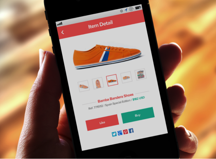
Flat design seems to be everywhere these days. Both Google and Apple (iOS7) have rolled out new flat features (and here are 25 other great examples of it). And when Apple does something, we know the rest of the design world usually follows. But is this just a temporary trend or could it be here to stay? We talked to some experts about why flat design isn’t going anywhere any time soon.
Sophia Chou, Chief Product Officer at Levo League, gave these 3 reasons:
- People are mobile: With mobile comes the need for responsive designs that look good on desktops, tablets and smartphones. Flat design tends to be more easily translated to many different screen sizes elegantly.
- Simplicity simplicity simplicity: Flat design allows users to focus on what’s really important: usability, functionality and content.
- Faster load times: The lack of gradients, drop shadows and other skeuomorphic design elements allows for quicker load times that are ideal for on-the-go web browsing
She told Skillcrush, “My personal feeling is flat isn’t a trend, but rather came from necessity to cater to more mobile, on-the-go, content-hungry, tech-literate population. Another word of advice to designers is to not go with flat design because it feels like a trend. Sometimes flat isn’t the way to go…”
Another web designer told us, “From a design perspective flat UI is a trend, but the reason it’s popular is because it makes it easier to prioritize content and highlight call to action. From a development perspective it decreases load time because it’s less code.”
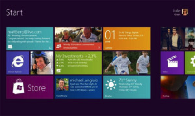
But there are times when flat design, well, falls flat. Flat design has to make sense in terms of usability. Even if it may be aesthetically pleasing, if you aren’t getting a good user experience than it’s pointless. Some sites have clearly chosen flat design over usability like Windows 8.
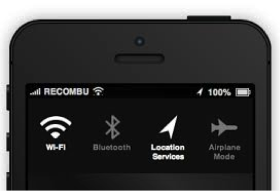
Some have even said parts of iOS7 are so flat they are a little confusing.
Flat design aesthetics need to go hand-in-hand with usability. And if a decision had to be made between aesthetics and user-friendliness, the latter should be prioritized over the former.
Chou says you never want to choose a web design just because it is trendy. Never sacrifice usability!
This piece was written by Meredith Lepore and is reprinted by permission.


