A groovy design trend you may have spotted in your Web travels is parallax scrolling, which refers to design elements appearing to move independently of each other. Its early application was in video games—think of how Super Mario stayed relatively center of your screen while the background appears to move sideways.
On websites, parallax design is user-controlled, often peppered with moving images, video and interactive hotspots as a user scrolls down or sideways on a page.
How “good” parallax design is for a website depends on its implementation, but the idea has radical potential for transforming the product page experience. Ecommerce and brand sites can use parallax design to better show products in context, romance value props feature-by-feature and guide customers through a prescribed flow of content (perfect for “story-selling”).
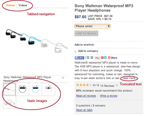
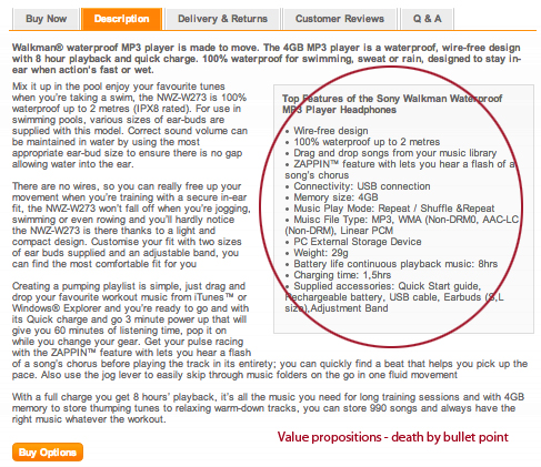
There’s no doubt customers crave product content. Traditionally, it’s organized on a product page like this:
With traditional product pages, it’s up to the user to explore content. It’s not guided. The user has to navigate between tabs (which users tend to overlook). Images are flat, and there’s usually no connection between product images and features/benefits. There’s a lot of clicking and closing required to view all the product images. While video helps conversion (if the customer notices the tab), it’s still disconnected from product copy.
Is this really the best way to romance and sell a product and show it in its best context?
Reinventing the Product Page Experience
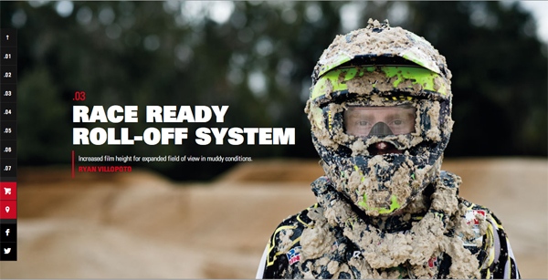
One of my favorite examples of a parallax product page is Oakley’s Airbrake MX Goggle. Please go ahead and experience this for yourself. We’ll wait. (Mobile readers note: the page is non-parallax for tablets and smartphones).
Welcome back.
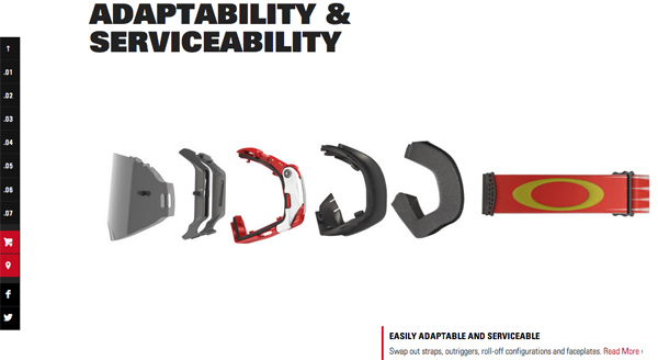
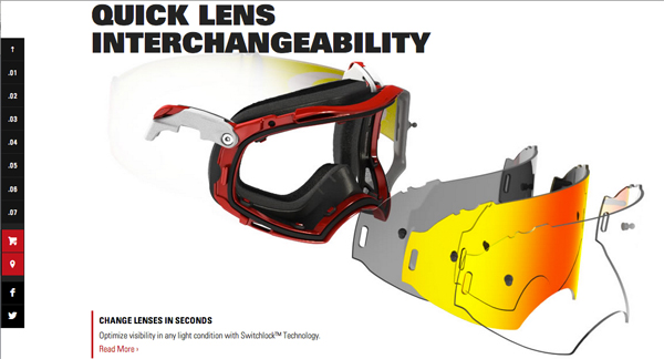
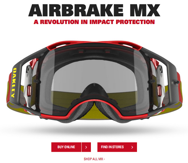
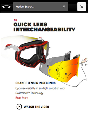
For you naughty readers that didn’t do their homework, I’ve included a few screenshots for context.
Even though these are stills, you can see how the product page experience is much more guided and in-context than traditional product pages, even without parallax’s slickness. This is how the experience appears for mobile users (the site is responsive). In fact, this type of experience is likely better for mobile users, as traditional product page templates were never designed for smaller screens or touch input.
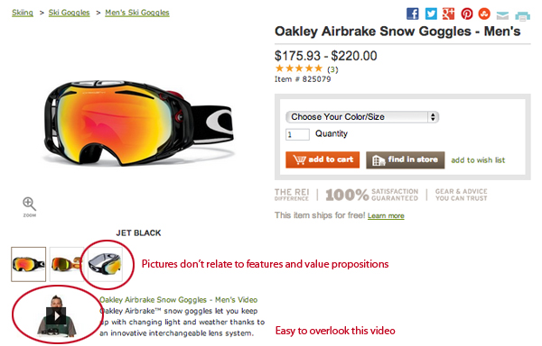
Contrast this with one of Oakley’s retail partner’s product pages:
Until you compare it to the guided product tour on the brand’s site, it looks just fine. It’s got multiple images, a well-done video, feature-benefit copy, intelligent cross-sells, customer reviews and a clear call-to-action. But it’s not an amazing experience. There’s no guarantee the customer is going to consume all the relevant content that really sells this pair of goggles. In fact, showing cross-sells is actually distracting from making a decision on the product.
Connecting to Commerce
We expect this from retail partners, but unfortunately Oakely’s brand site does what most brand sites do—link off to a separate bolt-on storefront with a product page layout and experience that’s just as vanilla as its retail partners.
Ideally, the customer is able to transact directly from the immersive experience, without being hijacked into a lesser experience. The problem usually is a content management system that’s not integrated with ecommerce functionality on the brand side and/or an ecommerce platform that can’t accommodate rich content experiences.
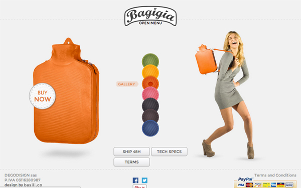
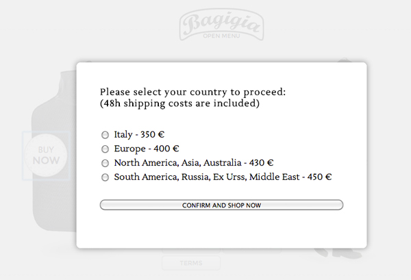
Bagigia is an example of a product page that integrates click-to-buy with its parallax experience. It doesn’t have to duplicate product pages across domains, confuse the customer or slow down the process.
Bagagia also has a great home page experience that walks you through the value props of its product and the story behind the brand. (Yes, your next assignment is to go experience Bagagia by clicking the link).
There’s no rule that parallax design needs to be site-wide, you could choose to apply it to just the home page, about page, certain brand or product pages or a specific campaign landing page.
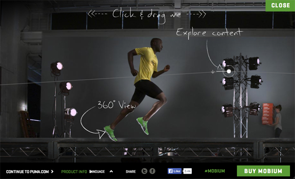
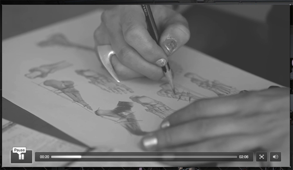
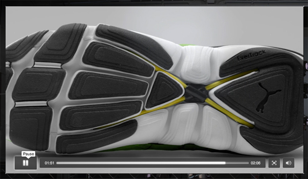
Puma’s Mobium is another one of my favorites. It packages some really interesting video content into a parallax experience (triggered by hotspots). Puma tells a great story of how this model was inspired by how a puma’s paw opens and closes as it runs and uses a special band at the bottom of the shoe that expands and contracts, mimicking your own plantar fascia.
There are some usability issues with Puma’s parallax, however. There’s no context around the hotspots, and the experience can be a bit difficult to control. It would also be nice to see an embedded call-to-action to buy or learn more about the product specs within the video content. The link to shop also leads to a 404 page — another reason why rich brand experiences should not link off to a separate store that may have an entirely different content maintenance team.
Pros of Parallax Design
1. Guided Selling and Storytelling – A parallax experience done well is more engaging than a flat, vanilla product, home, about or landing page. The marketer is able to guide the customer through a prescribed set of content, which also takes some of the guesswork out of product discovery.
2. More “Fun” Experience – A usability study by Perdue University found that on the dimensions of usability, satisfaction, enjoyment, fun and visual appeal, the parallax experience rated higher on “fun,” while not significantly higher or lower on any other dimension.
More fun. So what?
This study only measured parallax vs. the same layout in non-parallax. It didn’t measure a rich content experience against a traditional product page in an ecommerce context, for example. While self-reported enjoyment, satisfaction and fun may be warm and fuzzy, it’s worth testing for yourself to see whether the benefits described in this article apply to your site, provided you can technically accomplish the design and the test.
Something to keep in mind when testing: running one A/B test of parallax versus non-parallax (or versus a traditional product page), for example, could lead to a “we tried that and it didn’t work” conclusion if you don’t design parallax in a usable way. In other words, it wasn’t parallax that didn’t work; it was your treatment of it.
Cons of Parallax Design
1. Mobile
Parallax doesn’t really work on mobile devices, thus the experience shifts to non-parallax at certain breakpoints (if responsive), or directs traffic to a mobile optimized domain instead. While this isn’t a big deal, as a larger percentage of mobile visitors use your site, you may want to invest less in desktop-only experiences.
2. SEO
There is a trend toward rolling multiple pages (like an entire header menu) into a single, long-scrolling page in parallax. While this would never happen for a large website, there is a belief that the smaller sites that do so are shooting themselves in the SEO foot, as you can’t optimize individual pages for keywords and may not display sub-links in search results.
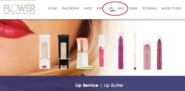
For small sites that do want to roll their main menu pages into a single-scrolling page, there is a workaround. Drew Barrymore’s FlowerBeauty.com maintains separate URLs in its architecture (rather than anchor links) that seamlessly transfer as you scroll down. Each URL can be keyword optimized, though this is undetectable to the user.
3. Performance
Parallax sites can load slower, which does impact SEO as well as conversion, customer satisfaction and site usability. Like with responsive design, speed kills, so ensure you’re not sacrificing performance for pizzazz with optimization and testing.
Is Parallax Just a Fad?
Design trends come and go. Skeuomorphism is making way for flat design. Carousels are making an exit thanks to the rise in mobile traffic. Drop-down menus dropped out in favor of mega-menus. Splash screens deserved to die. Parallax may be next.
There are only a handful of ecommerce sites experimenting with parallax today. It’s not actually an ecommerce trend as much as an opportunity for brands and marketers to create immersive content experiences. With any non-conventional experience, there’s risk of it not being usable or not positively affecting conversions. On the flipside, parallax helps a site stand out because it’s not conventional.
Why Ecommerce Design Must Evolve
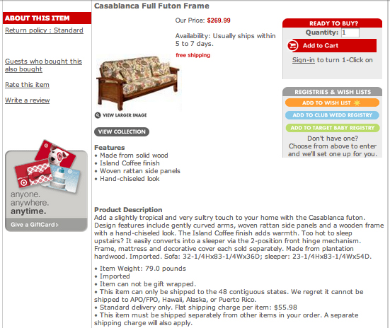
What I’m excited about is how such an immersive experience challenges the traditional product page. Check out Target’s product page template from 10 years ago—it looks just like the majority of product pages today.
The world has changed since 2004. The Internet is faster. Screens are bigger. Screens are smaller. Devices are mobile. We use touch screens. CSS has come a long way. CMS capabilities have come even further. Apps!
Whether it’s parallax scrolling or something else, the brands and retailers that embrace a new way of guiding the customer through a content experience and explore reinventing the ecommerce experience have the advantage. We may need to rethink product pages, home pages, search and checkout. Is the status quo good enough, or is there something better?
I believe there’s something better. Kudos to the designers and marketers who embrace innovative content experiences.
Post-script
If you want to check out some more sites using parallax, check out:
Rimmel
Sony
Oakley Outerwear Guide
Local Apparel
Flower Beauty
VonDutch
The Verge
Flat vs. Realism
Image credit: CC by Jonathan Tucker


